Best coding fonts are not just a design choice—they directly affect how fast you read code, how long you can work without fatigue, and how many mistakes you catch before they become bugs. If you’ve ever stared at your screen wondering why your eyes feel tired after just an hour, or why small syntax errors keep slipping through, the problem might not be your skill—it might be your font. In 2026, developers who optimize their environment are gaining a real edge, and typography is one of the most underrated upgrades you can make.
Coding for hours every day creates a very specific type of strain. Characters start blending together. Symbols look identical. Your brain works harder than it should just to interpret what’s on the screen. That silent friction slows you down more than you realize. The right typography removes that friction, making code feel smoother, clearer, and almost effortless to read.
There’s a reason experienced developers obsess over their setup. It’s not about aesthetics. It’s about clarity, speed, and reducing cognitive load. Once you experience the difference a well-designed coding typeface makes, going back feels impossible.
Why Your Font Choice Is Quietly Slowing You Down
Most developers start with default settings and never question them. That’s where the problem begins. Default fonts are designed for general use, not for scanning dense lines of logic, nested structures, and complex symbols.
When characters like “1”, “l”, and “I” look similar, your brain pauses. When spacing feels cramped, your eyes strain. When punctuation isn’t clearly defined, debugging takes longer than it should. These tiny inefficiencies stack up over hours and days.
Professional developers understand something beginners often miss: productivity isn’t just about writing code faster—it’s about reducing mental friction. A better font removes unnecessary thinking, allowing you to focus on solving problems instead of decoding text.
In real-world testing environments at major tech companies, developers reported noticeable improvements in readability and reduced fatigue simply by switching to optimized coding fonts. Some even measured fewer syntax-related errors during long sessions.
What Makes a Font Perfect for Programming
Not all fonts are built for code. The best ones share specific characteristics that make them ideal for long development sessions.
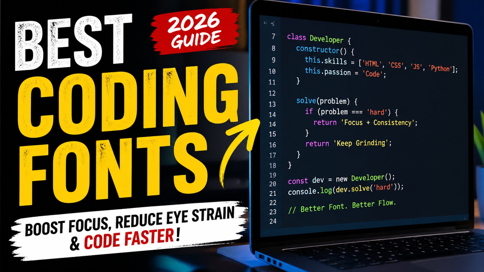
Monospaced design is the foundation. Every character takes up equal horizontal space, which keeps code aligned and easier to scan. Without this, indentation breaks visually, and structure becomes harder to follow.
Clear character distinction is critical. Letters and symbols must be easily distinguishable at a glance. This includes differentiating between similar-looking characters like zero and the letter “O,” or brackets and braces.
Readable punctuation is another key factor. Developers rely heavily on symbols. If commas, semicolons, and brackets aren’t visually sharp, mistakes happen more often.
Balanced spacing improves flow. Too tight, and everything feels cluttered. Too wide, and your eyes travel too much. The best fonts find the perfect middle ground.
Modern fonts in 2026 also include programming ligatures, where combinations like “!=” or “=>” transform into cleaner visual symbols. Some developers love this feature because it improves readability, while others prefer traditional rendering. The choice depends on personal workflow.
The Hidden Frustration Developers Don’t Talk About
Here’s something most articles won’t tell you: many developers think they’re bad at focusing when the real issue is visual fatigue.
You sit down to code, full of energy. After an hour, your concentration drops. You assume it’s discipline. In reality, your eyes are working overtime to process poorly rendered text.
This leads to frustration, slower progress, and even burnout over time. It’s not dramatic—but it’s real.
When developers switch to better typography, they often describe the experience as “relief.” Suddenly, everything feels clearer. Reading becomes faster. Mistakes become easier to spot. That small change can have a surprisingly deep impact on daily productivity.
How Modern Developer Fonts Changed the Game
The evolution of developer-focused fonts has accelerated in recent years. In 2026, typography is no longer an afterthought—it’s a performance tool.
Fonts are now designed with developer psychology in mind. Designers study how programmers read code, where their eyes focus, and what slows them down. The result is a new generation of typefaces optimized for clarity and speed.
One major shift is the rise of customizable fonts. Developers can now adjust weight, spacing, and even stylistic elements to match their personal preferences. This level of control wasn’t common just a few years ago.
Another breakthrough is improved rendering on high-resolution displays. Modern fonts look crisp across different screen sizes, reducing strain even further.
Real Experience: What Actually Works in Daily Coding
After working with multiple development environments and testing different setups, one thing becomes clear: the right font changes how you feel about coding itself.
In one real-world case, a frontend developer working on a complex React application struggled with frequent syntax mistakes. After switching to a clearer, more readable font, their error rate dropped noticeably within a week. Not because they suddenly became more skilled, but because the visual clarity improved.
Another backend developer reported being able to code longer without fatigue simply by adjusting font size and switching to a typeface with better spacing.
These aren’t isolated cases. Across forums and developer communities, the pattern is consistent. Better fonts lead to better focus.
Best Coding Fonts That Developers Are Quietly Switching To
When developers start exploring typography seriously, they often discover a handful of fonts that consistently outperform others in real-world usage.
Fira Code has become a favorite due to its clean design and optional ligatures that make complex operators easier to read. JetBrains Mono, designed specifically by developers, offers excellent readability and balanced spacing. Cascadia Code, backed by Microsoft, brings a modern feel with strong clarity across different environments.
Source Code Pro remains a solid choice for those who prefer a more traditional look without distractions. Meanwhile, newer fonts in 2026 are pushing boundaries with improved customization and rendering.
What matters most is not just popularity, but how the font feels during long sessions. The best font is the one that disappears—letting you focus entirely on your code.
Choosing the Right Font Based on Your Workflow
Different types of developers have different needs. A frontend developer working with design-heavy projects may prefer a font that feels modern and visually balanced. A backend engineer dealing with dense logic might prioritize maximum clarity and distinction.
If you spend long hours debugging, choose a font with highly distinguishable symbols. If you write a lot of code quickly, spacing and flow become more important.
Screen size also plays a role. Larger monitors can handle slightly wider fonts, while smaller screens benefit from more compact designs.
There is no single perfect font for everyone. The goal is to find the one that aligns with your workflow and reduces friction in your daily tasks.
How to Instantly Improve Your Coding Setup (Simple Fixes)
You don’t need a complete overhaul to see results. The partial changes can make a big difference.
Start by increasing font size slightly. Many developers use fonts that are too small, which increases strain over time.
Adjust line height for better readability. More vertical spacing makes it easier to scan code quickly.
Experiment with themes. Light and dark modes interact differently with fonts, affecting overall clarity.
Test your setup for at least a few days before deciding. Your brain needs time to adapt.
These simple adjustments often lead to immediate improvements in comfort and productivity.

The 2026 Advantage: Why Early Optimization Matters
In today’s competitive environment, small optimizations create big advantages. Developers who refine their workflow gain more than just speed—they gain consistency.
As AI tools and automation continue to evolve, human developers are expected to focus on higher-level problem solving. That requires mental clarity, not constant visual strain.
Optimizing your coding environment, starting with typography, is one of the easiest ways to stay ahead without learning a new framework or language.
Author Perspective: Why This Matters More Than You Think
As someone who has spent years working with content systems, development workflows, and performance optimization, I’ve seen firsthand how small changes create big results.
Many people chase complex solutions while ignoring simple fixes that have immediate impact. Fonts are one of those overlooked areas.
This isn’t theory. It’s a practical, tested improvement that affects how you work every single day.
When your tools support you instead of slowing you down, everything changes. Coding becomes smoother. Focus lasts longer. Results improve naturally.
Final Thoughts: A Small Change That Feels Like a Big Upgrade
Most developers never question their font choice. They adapt to discomfort instead of fixing it. That’s a mistake.
Choosing the right coding font is one of the simplest ways to improve your daily experience without extra effort. It doesn’t require new skills or major changes—just awareness and a willingness to experiment.
Once you find the right setup, you’ll notice the difference immediately. Your code will feel clearer. Your mind will feel lighter. And your workflow will finally match your potential.
FAQS
What is the most comfortable font for coding?
The most comfortable font depends on personal preference, but fonts with clear character distinction and balanced spacing tend to perform best. Many developers prefer fonts designed specifically for programming because they reduce eye strain and improve readability.
Do coding fonts really improve productivity?
Yes, better fonts reduce visual strain and make code easier to read. This leads to fewer mistakes, faster debugging, and improved focus over long sessions.
Should I use fonts with ligatures?
It depends on your preference. Some developers find ligatures helpful because they simplify complex symbols, while others prefer traditional characters for full control.
What font size is best for coding?
Most developers find a slightly larger font size more comfortable for long sessions. The ideal size depends on your screen and resolution, but readability should always be the priority.
How often should I change my coding font?
You don’t need to change it frequently. Once you find a font that feels comfortable and improves your workflow, stick with it unless your needs change.
Also Read: Penzu Secrets Revealed: The Powerful Truth About Private Digital Journaling in 2026